5 out of 5 stars.
its cool! it's such high quality! i'd love to see more soon!
just, not bei ng rude but the desc looks like AI so 😅
描述就是AI - by
Yoko on August 18th
描述就是AI - by
Yoko on August 18th
My input method caused me to comment twice. - by
Yoko on August 18th
What I mean is, the description is indeed generated by AI. - by
Yoko on August 18th
Because if I were to describe it myself, it would probably be: a Gothic-style mouse pointer. - by
Yoko on August 18th
I'm a boring person, and I don't like writing instructions for the things I create. - by
Yoko on August 18th
But it's obvious that this is because I'm very familiar with the work. - by
Yoko on August 18th
However, it might be too rudimentary for others. - by
Yoko on August 18th
That's why I used this method. - by
Yoko on August 18th
I don't have any particular likes or dislikes towards AI, because it's just a tool. - by
Yoko on August 18th
Ultimately, everything hinges on the final result. - by
Yoko on August 18th
5 out of 5 stars.
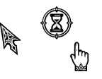
This looks great I like the busy animation and alternate select cursor a lot, it really does look like stone.
 ...
on August 20th
0
...
on August 20th
0
0.5 out of 5 stars.
are you sure you didn't use ai to generate these cursors? i don't think it was just the description you used ai for. i'm taking a closer look at these cursors and details are placed randomly and faded, they don't make any sense. for example, the link.cur -- fingernails are drawn where it wouldn't make logical sense for them to be, since it's a pointing finger.
in the busy animations, the surrounding circles aren't the same in the hourglass animations. another thing we can point out is the differences between the horizontal and vertical cursors. their markings are completely different. this wouldn't make sense if they were both sized down from an original image. because you could simply flip one image to create a horizontal and repeat for the other.
same for the diagonal cursors... they aren't the same. random details missing from one and perfect "fine" with the other. really disappointing if this is ai generated. honest, hard work is better than using this for quality.
It was indeed generated by AI, but the quality is really poor, so I plan to reconstruct it. - by
Yoko on August 22nd

 Sign in
 Share
Share Tweet
Tweet Share
Share Pin it


 Resources


 Top reviews
 GothicSigilCursor Cursors

 reddit