 Sign in
 Share
Share Tweet
Tweet Share
Share Pin it


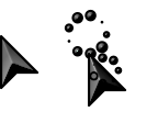


 my first Cursors
- Published on February 17th 2026 under the Release to Public Domain license.
my first set
not all sizes are the same
my first Cursorsmy first set
not all sizes are the same
 Resources
 Top reviews
Honestly, for a first set, it's not the worst. I think the proportions are off on the link select, and as stated in the description, not everything is sized equally, but it looks nice for what it is.
dominik
on February 20th
5
u
Not that bad for a first set. I like the concept of the location select cursor. The busy cursor could use a hotspot fix.
 HIM
on April 9th
0
HIM
on April 9th
0
They are really cool, but just too basic.
Probably better, fix the hot spots, and is goood for a first set
Find out how Vista icons differ from XP icons.
See how RealWorld Icon Editor handles Vista icons.
 reddit